
Loading...
2nd August 2021

“it was the free market which produced affordable housing,
before government intervention made housing unaffordable.”
Thomas Sowell
 During lockdown a few of you became familiar with my Irish terrier, Barney. When I started working from home Barney took to sleeping under my desk. He would often pick the most inopportune of moments to poke his ginger snout into view, in the bottom left-hand corner of the Zoom screen. This was especially the case when I was talking with Andy, who’s voice Barney came to recognise. It seems even dogs and humans can get to know one another over Zoom these days. Sadly, Barney is no longer with us. My Zoom calls are now less disturbed, but also a bit less fun.
Barney did not just make lockdown more bearable, he also made an important contribution to the analysis of macroeconomic policy. In his honour I have named his contribution ‘Barney’s Policy Curve’ or ‘Barney’s P Curve’ for short. The following is an explanation of Barney’s P curve which, I suspect, describes a universal characteristic of all government macroeconomic policy interventions.
A few months ago, I had my back garden re-turfed. Within a few weeks my pristine new lawn was peppered with circular patches of dead grass. Interestingly, the patches of dead grass were encircled with rings of abnormally healthy grass. This grass was growing noticeably faster than the rest of the lawn.
Luckily, one of our clients, who happens to be a Doctor of Plant Molecular Biology, explained the origin of these grass donuts (thank you Wendy). The cause was Barney, who had been randomly dosing my new lawn with a nitrogen-rich liquid fertiliser. Nitrogen, I’m told, is a vital macronutrient necessary for plant growth. The addition of the extra nitrogen was leading to the circles of more vigorous growth. But, if the concentration of nitrogen exceeds a certain threshold, the grass begins to suffer an effect known as nitrogen toxicity. Nitrogen toxicity first hinders growth and then, as the dose is increased, eventually kills the grass completely. My newly laid lawn, with its relatively shallow roots, was especially susceptible to nitrogen toxicity.
Figure 1 shows an example of one of these grass donuts overlaid with stylised graphs of Barney’s presumed dosing regime and the resultant growth profile of the grass.
These grass donuts are a good example of how complex systems often respond, in a non-linear manner, to changing levels of stimulus. Frequently, as is the case here, the non-linearity is so extreme the response does not just change in magnitude it also reverses direction.
For commercial agriculture, where the aim is to efficiently boost crop yields, understanding this complex non-linear relationship is vital. Too little fertiliser will lead to a poor crop but too much fertiliser could lead to both a big fertiliser bill and total crop failure.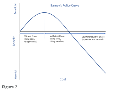
Figure 2 shows a stylised representation of this type of non-linear cost-benefit relationship. The curve splits into three distinct phases. Initially, the relationship is linear and positive. This phase could be classified as ‘the efficient phase’ because increased expenditure leads, almost linearly, to the desired increased output. The second stage, which occurs at higher cost, is an ‘inefficient phase’ because, in this regime, increasing expenditure reduces the benefits and, at every point in the inefficient phase, there is a lower-cost way to achieve the same benefit in the efficient phase. The third and final stage, the highest cost phase, is a ‘counterproductive phase’ because here the outcome is now below that which would have been achieved without any intervention at all.
In the biological sciences, and especially in medicine, non-linear relationships of this type are commonplace and well understood. Doctors know drugs must be administered in safe doses and that even the safest drugs will become toxins if used to excess. Unfortunately, economics is not as sophisticated as either medicine or agriculture. Economics still relies, almost exclusively, on linear models (The Laffer Curve is a useful counterexample) and those linear models tend to lead to similarly linear thinking in economic policy decisions. If one dose of a policy produces one unit of the desired outcome, it is usually assumed two doses of the same policy will yield two units of the desired benefit. We believe, this sort of linear thinking is almost always wrong when it comes to government intervention in the economy. Indeed, we are struggling to think of a single government intervention in the economy that is unlikely to follow Barney’s P curve and become counterproductive when taken to extreme (please drop us an email if you have a counterexample).
In ordinary circumstances, the constraints of balanced budgets – the need to keep government spending linked to tax receipts – usually constrains spending and helps keep policy intervention toward the more useful left-hand side of Barney’s policy curve. Recently, however, the advent of Modern Monetary Theory – the idea that governments need-not and should-not balance their budgets – has largely removed spending constraints. Without spending constraints policymakers can follow the advice of their linear-thinking modelers who tend to advise ever increasing the levels of policy intervention. This risks pushing spending to the right of Barney’s policy curve, into the inefficient and counterproductive phases.
We are concerned when policy makers see their policies becoming ineffective and counterproductive their instinct will be to fix the problem with even more counterproductive spending. If so, we may see a spiral of higher spending accompanied by lower or even negative benefits.
Higher spending for smaller rewards is a reasonable working definition of inflation. In our view, the easing of budget constraints, due to the adoption of MMT, has substantially increased the risk of government policies becoming counterproductive and therefore inflationary over the coming decade.
***
To join our distribution list, please send ‘subscribe’ to: info@Equitile.com
 Is corporate debt addictive?
2
 Investment Letter - Eternal Adaptation
2
 Tales of an Astronaut - Lessons from the Unknown
2
 Revival of the Fittest
2
 When Science Fails
2
 Investment Letter - Constant Reformation
2
 Seductive Charm
2
 Can fair fees make active managers more sustainable?
2
 Regulating Psychopaths
2
 An Impossible Trinity?
2
 Monetary Policy on a War Footing
2
 0
0
 Revolutionary Fervour
2
 2016: A Tale of Two Walls
2
 Modern Monetary Theory - The Magic Money Tree
2
 Facts not Opinions
2
 Hanging the Wrong Contract?
2
 Luddites and the New Social Revolution
2
 No Hard Promises - thoughts on inflation after COVID-19
2
 Public Deficits, Private Profits
2
 When Prophecy Fails - How to ignore doomsday forecasts
2
 The Anxiety Machine - The end of the world isn't nigh
2
 Hedonism and the value of money - Part I
2
Register for Updates
12345678
-2